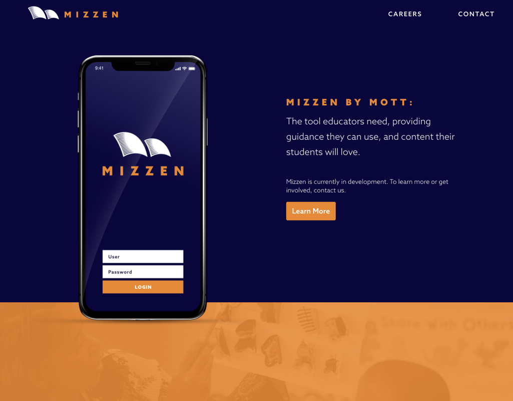
Mizzen by Mott: Guess what we've been working on!
In 2022, we had several opportunities to engage with your feedback on the Mizzen platform. From your brilliant insights, we are excited to share some updates! Next time you log in to the platform, you’ll notice some changes.
Beyond a new homepage layout, you’ll find new functions, navigation features and ways to sort and save your favorite activities.
We aim to continue making your user experience as delightful and easy as possible. Let us know what advice you have for our team by dropping us a note here!
Platform Updates
 Homepage
Start your day with Mizzen by checking out the weekly highlight section with featured learning resources and content from our partners to help plan your week.
 Search Bar
Get your search on in a much easier and refreshed way! On the homepage, you’ll notice a new search bar. Type in a keyword or content topic and experience Mizzen magic with search results generated in seconds. You can still use the filtering system for specific content when you browse the library.
 Filters
We updated the filter search and added new keyword additions. You’ll also find that you don’t have to “clear” the filters each time you return to the platform.
 Activity Section
On the home page, you’ll see a new section called “Collections.” In this space, you will find access to modules and playlists. You’ll see a dropdown menu on the right side that will let you explore by modules, playlists or all collections.
 Navigation
If you’re using the desktop browser version of Mizzen, you’ll notice the navigation bar has moved from the left to the top. If you are using the mobile version or app, the navigation menu is in the same place.
Let’s keep designing and growing together!
 P.S. Keep reading to discover ways to engage with Mizzen this month!